Client: Courage Milwaukee
Courage Milwaukee, better known as Courage MKE, is a non-profit organization helping homeless LGBTQ+ youth by providing shelter, healthcare, and scholarship. Founded in 2015, the non-profit needed a logo refresh and an updated website.

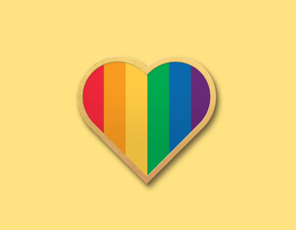
Since its inception, Courage's heart logo (left) has been synonymous with the organization. Instead of starting from scratch, I refined the shape and filled the mark with solid band for better visibility (right).
Courage also didn't have a set typography set. I used Roboto because of it's dual nature. It has a mechanical skeleton and the forms are largely geometric. At the same time, the font features friendly and open curves. While some grotesks distort their letterforms to force a rigid rhythm, Roboto doesn’t compromise, allowing letters to be settled into their natural width. This makes for a more natural reading rhythm more commonly found in humanist and serif types.

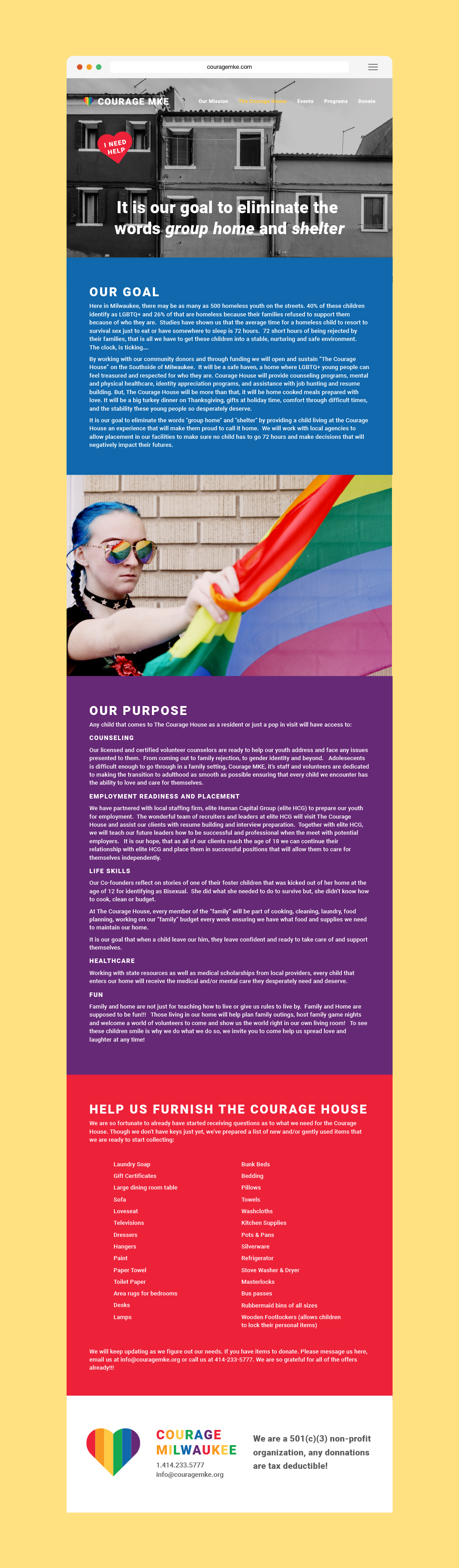
The most challenging thing to tackle for this project was the website. Courage's website is filled with important information for a wide audience. Before the redesign, text boxes floated between images and made everything confusing and unclear. Using the color bars in the logo, I was able to establish a hierarchy of information and contain sections. The completed website is welcoming, clean, and bright. Website is a prototype and stock images are from unsplash.


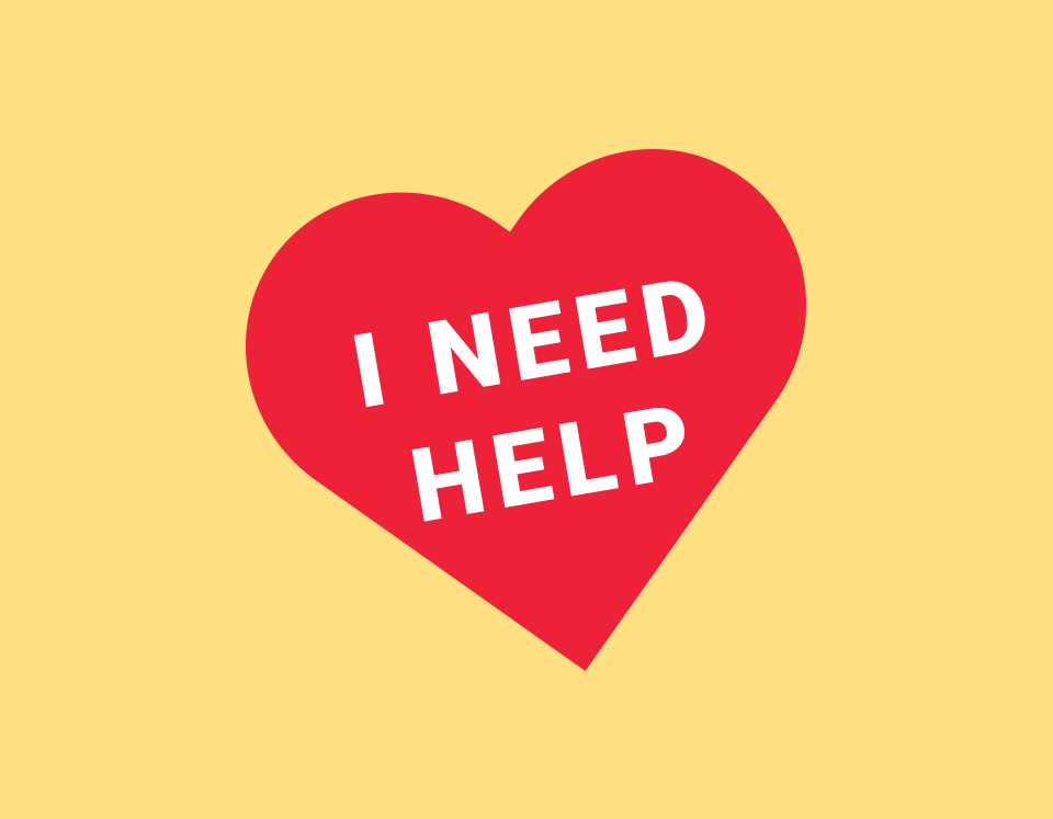
This icon was created and featured on every page as a quick click for a hotline number with immediate assisstence.